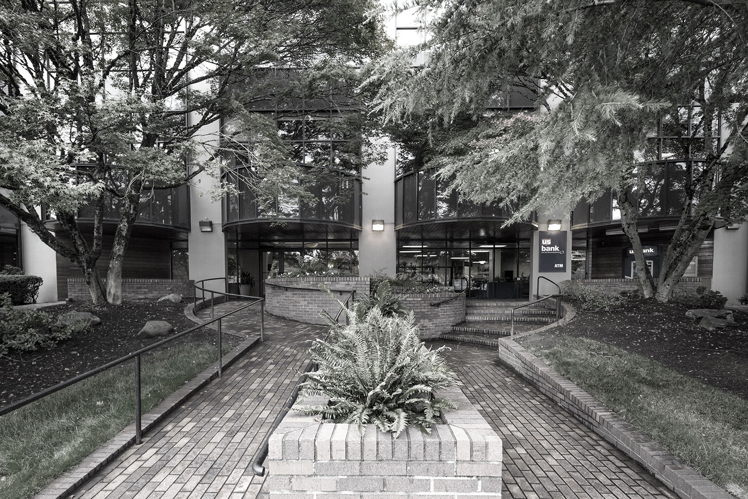
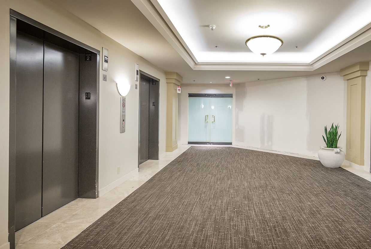
FFA was contracted to re-imagine the way The Riverside Centre building represents itself to both its surroundings as well as to existing and future tenants. Located near Portland’s South Waterfront, the building began as a World War II-era furniture warehouse. In the late 1970s, it was repurposed as a commercial office building. The initial renovations presented what was, at the time, a ‘modern’ workplace. However, it did not include ADA-compliant entries or restrooms and provided nothing in the way of amenities or opportunities for occupants to engage outside their individual business suites. Additionally, it had no presence to the public, or to those trying to find it, as it was tucked away and surrounded by overgrown trees.
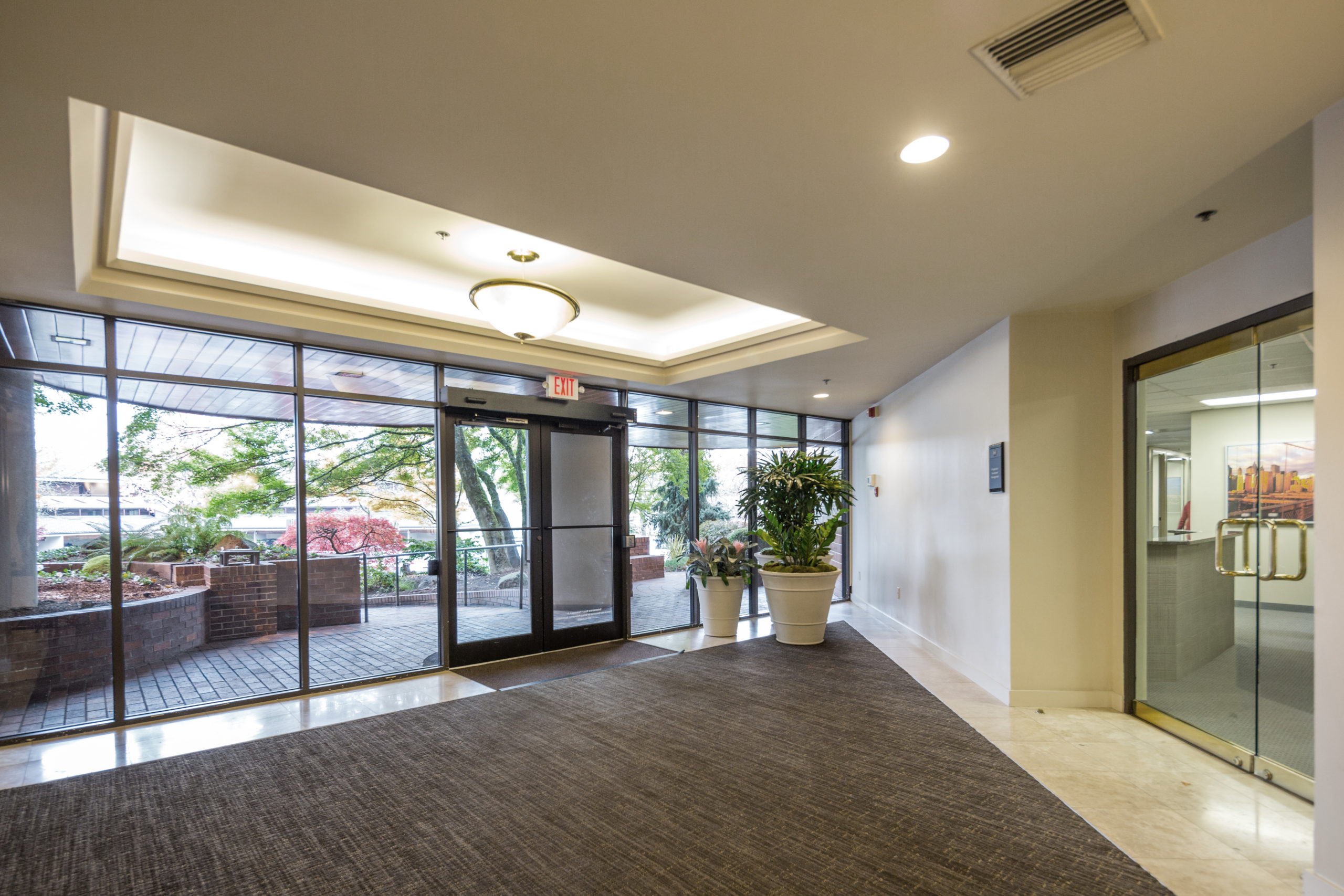
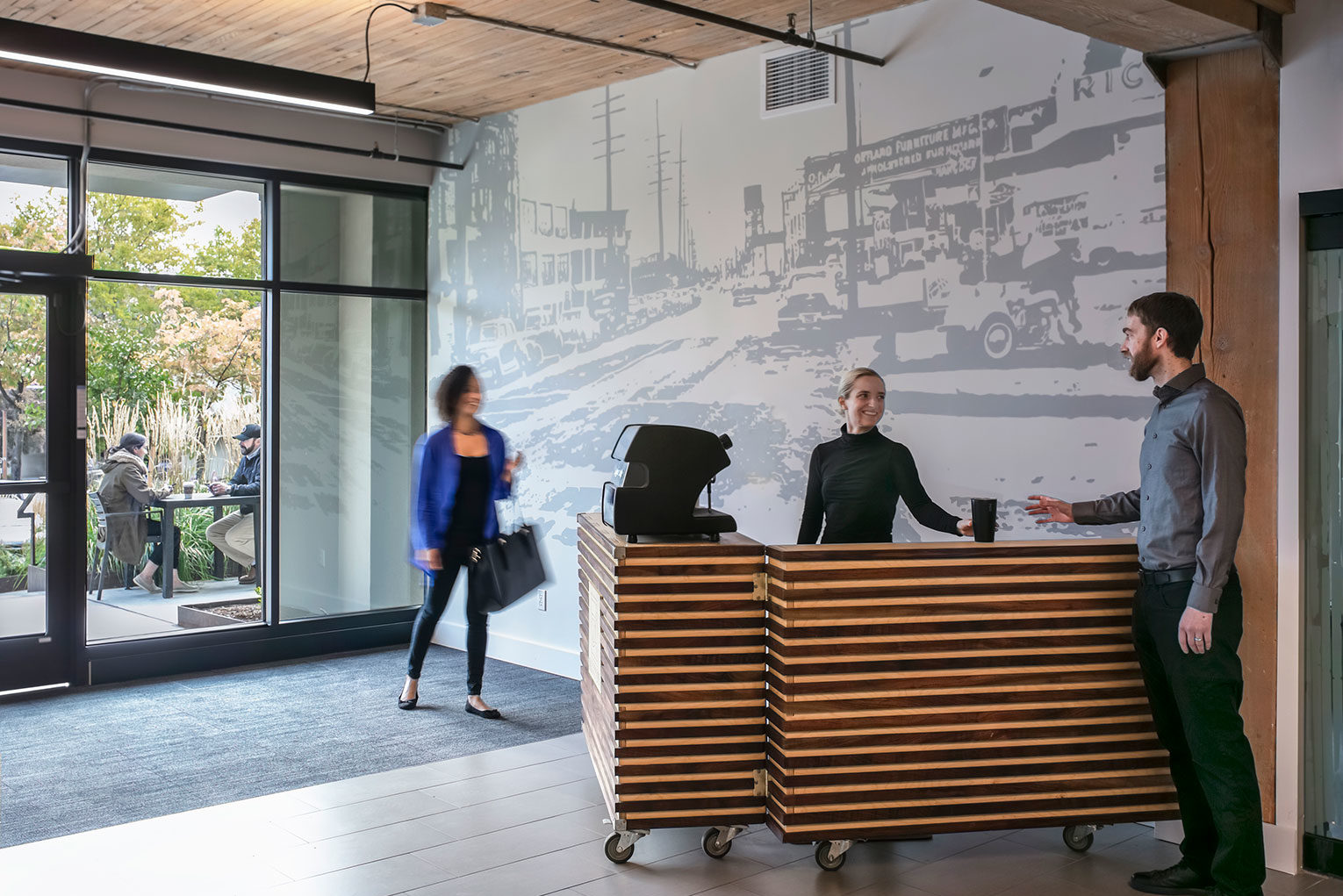
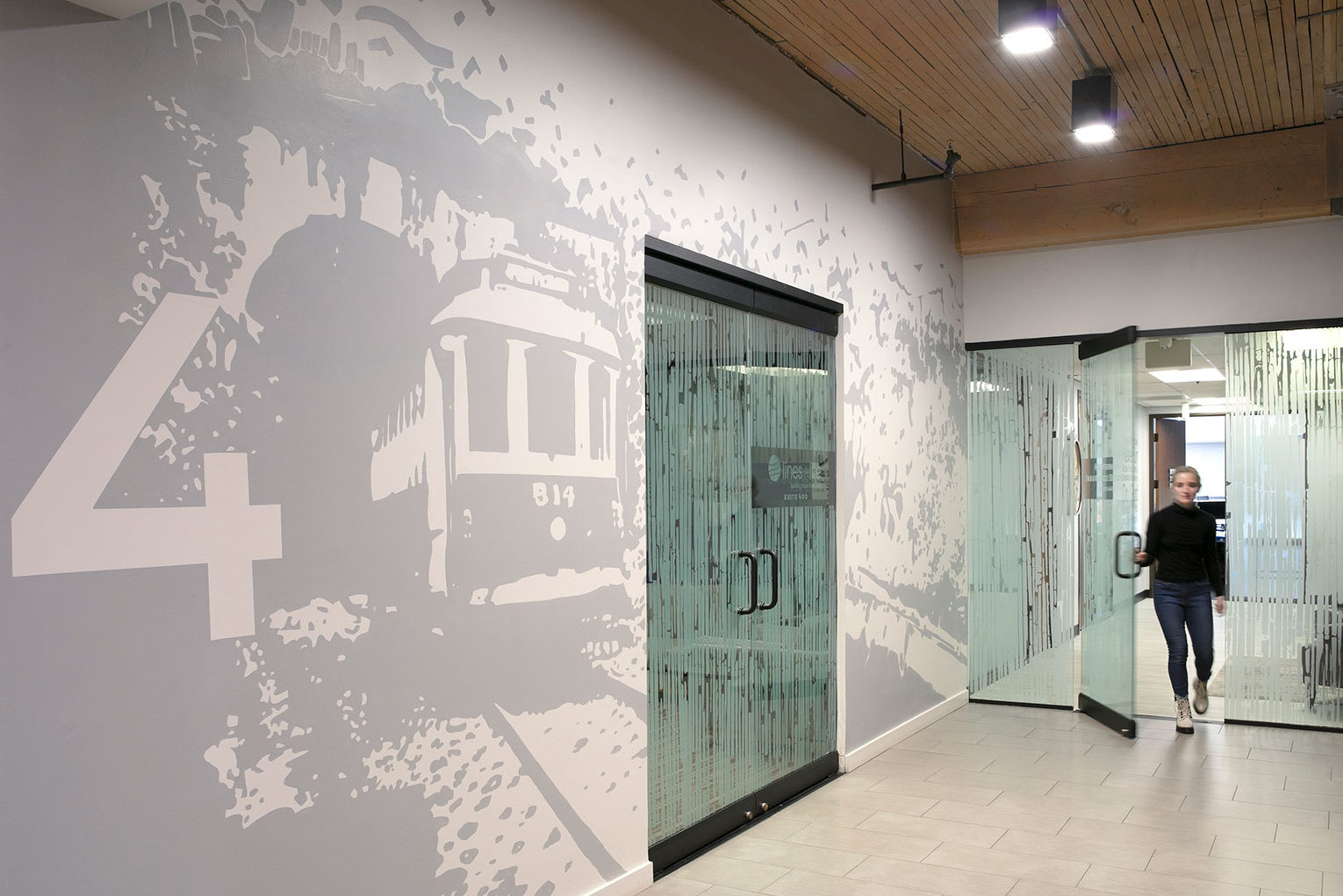
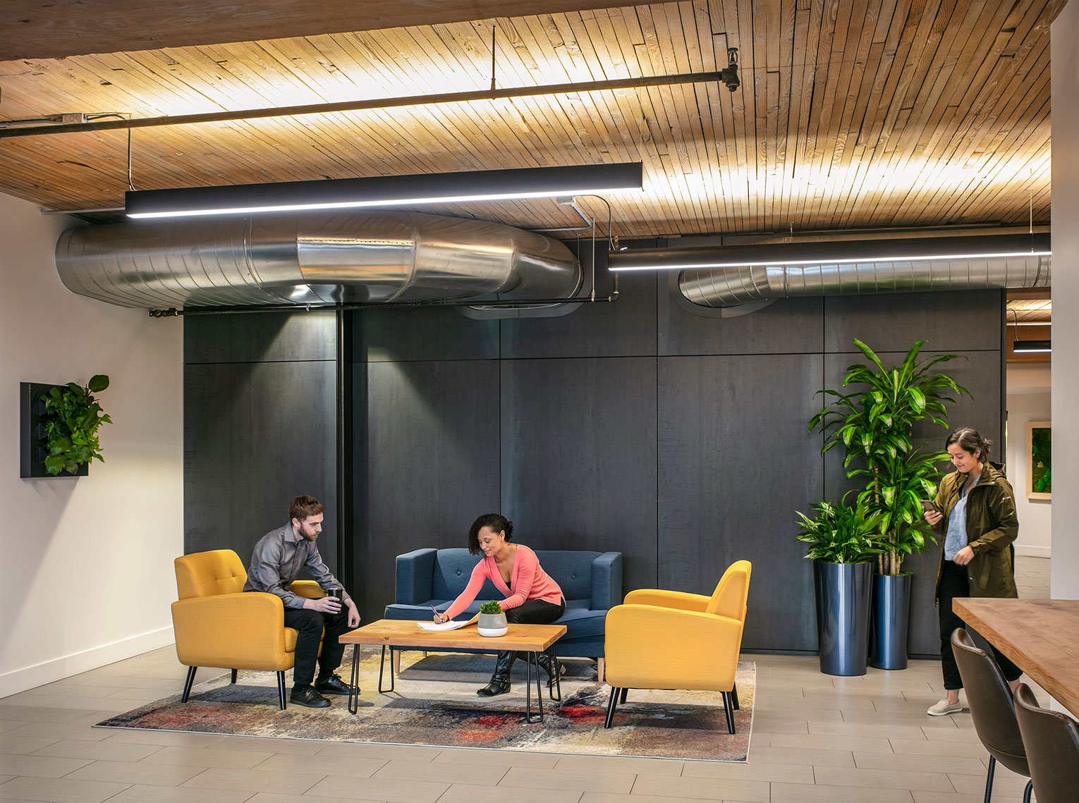
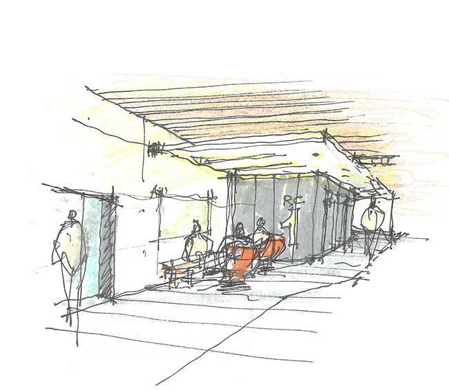
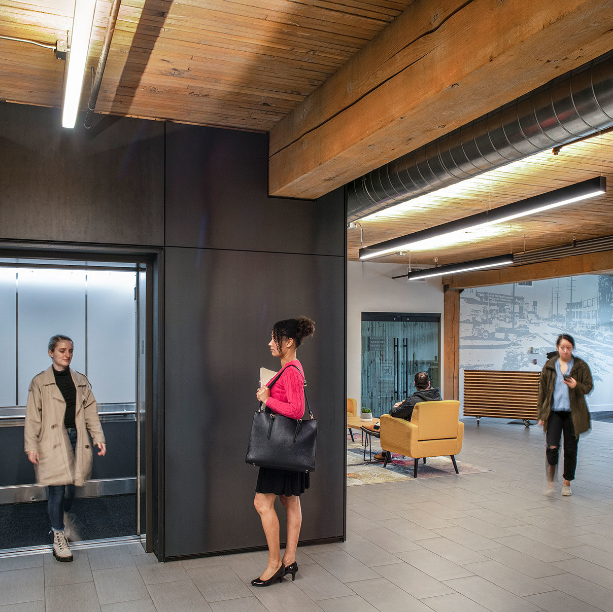
FFA’s approach first began by unearthing the bones of the building – giving it back its industrial identity. By removing interior details which masked original features, we uncovered the historic palette of the concrete and heavy timber structure. Now, the public spaces boast ceilings that are over four feet higher than they had been. Playing off the cool of the concrete and the warmth of the exposed timber, our team chose materials and finishes for the common areas that are durable and subtle to allow the industrial structure to be the highlight of the space. Gathering spaces were carved out to allow people to connect, and the building owner incorporated bright furnishings to complement the concrete, steel and raw wood building details.
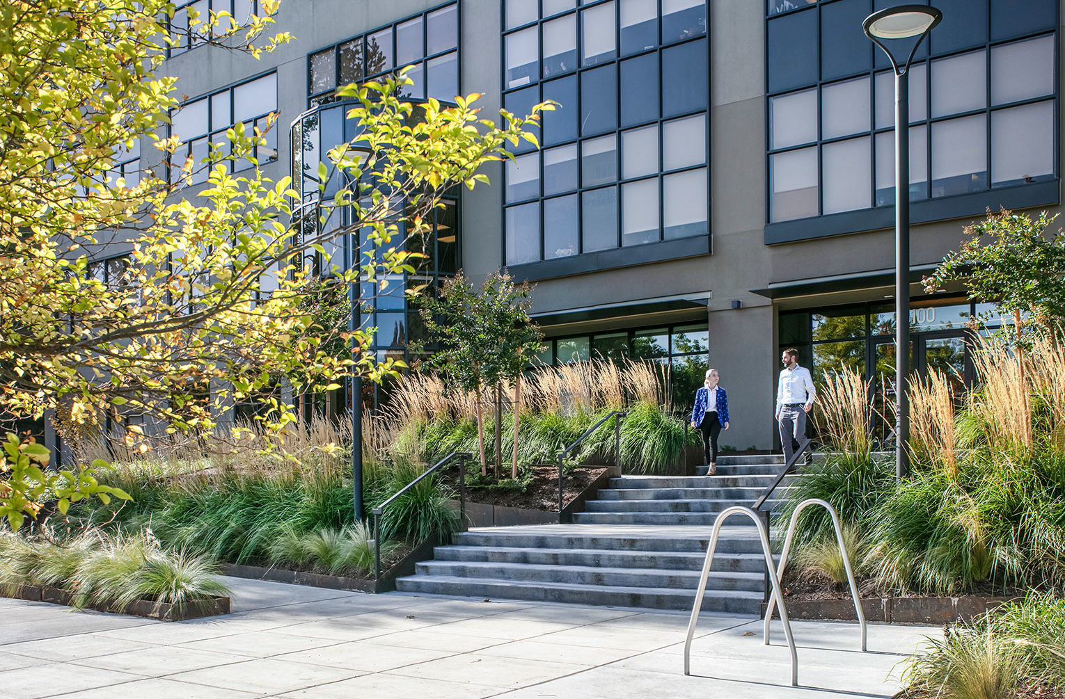
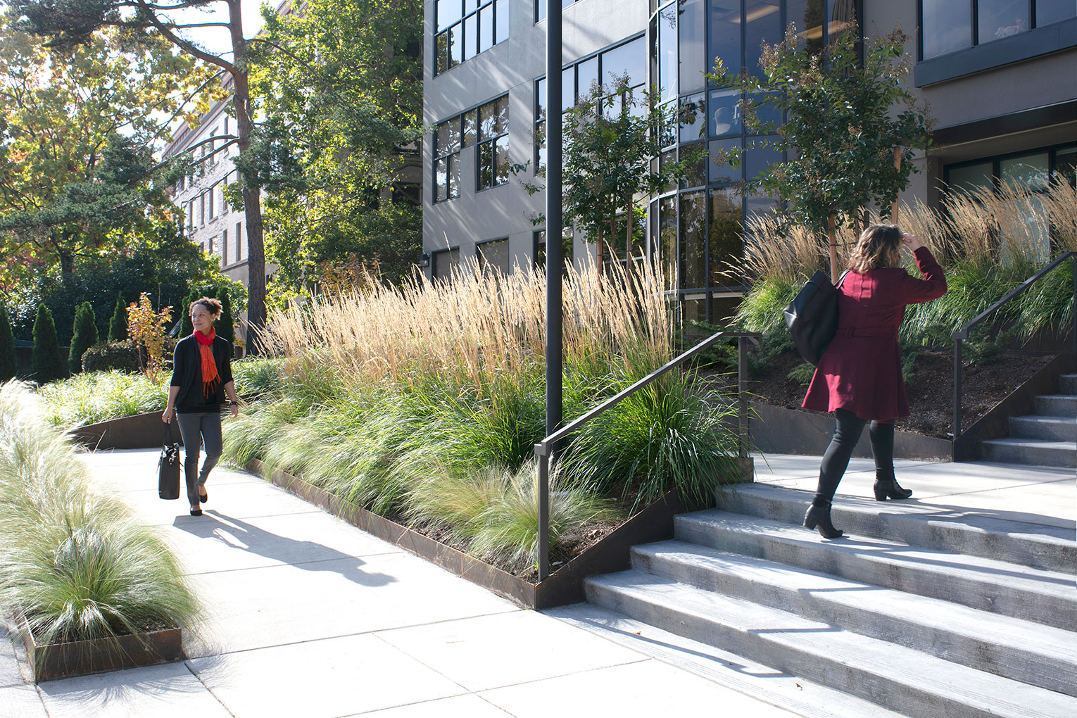
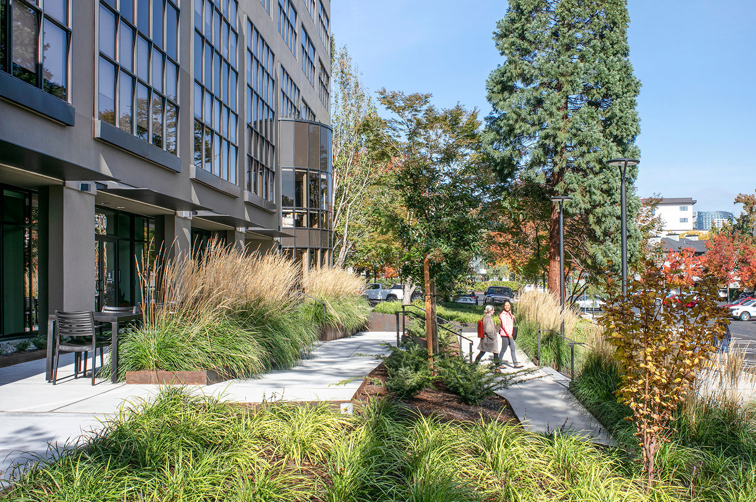
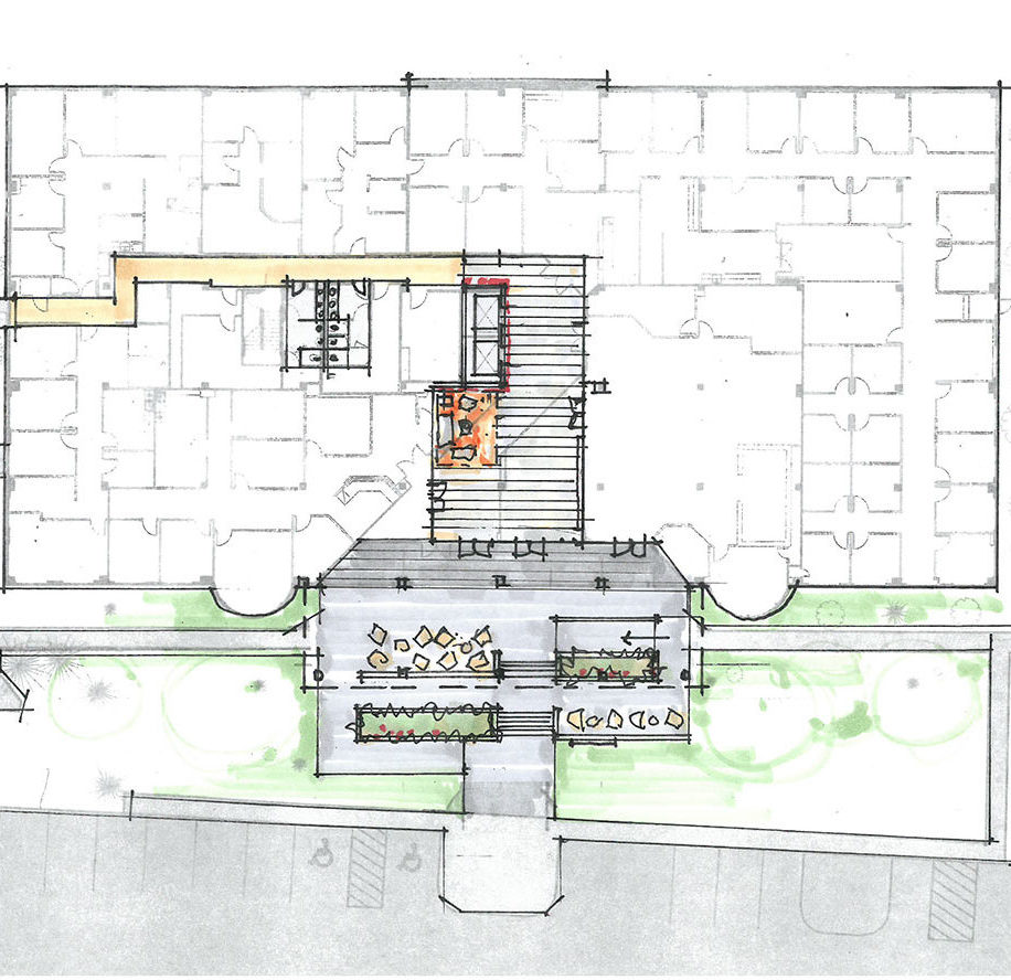
The next step was to support the needs of modern-day tenants by providing appropriate exterior amenities, ADA access and a warm presence to building occupants and visitors. The design team eliminated overgrown landscaping and a narrow brick approach with the intent of creating a furnished ‘front porch’ which tenants and their guests can enjoy. Clean, simple, newly poured concrete steps and an accessibility ramp now meander through a rich landscape of native grasses, providing a welcoming approach to the building which had previously been lost in its surroundings.
2020
100,000 sf
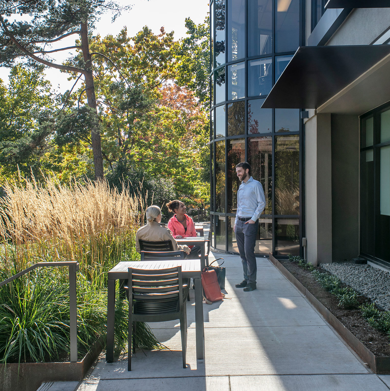
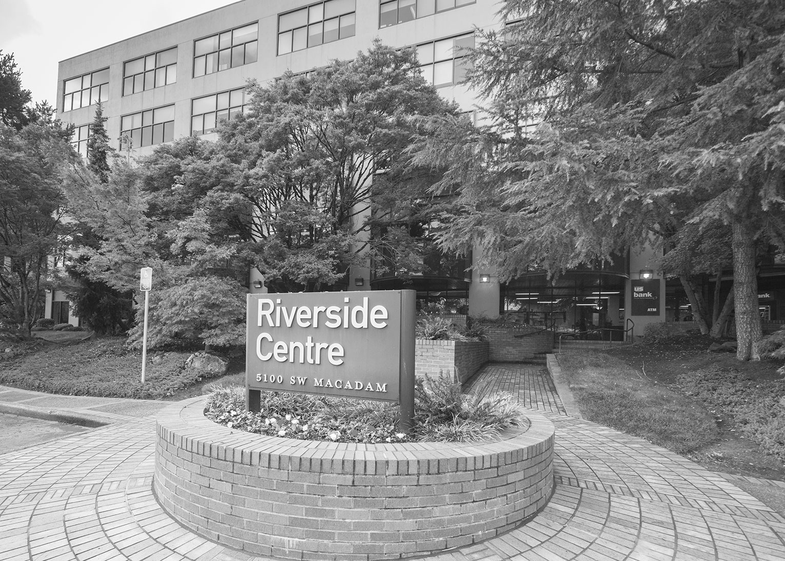
BEFORE AND AFTER
Compare images of the building’s previous state to it’s refreshed look. One of the key elements to tenant improvements is understanding the existing space’s potential for change.
