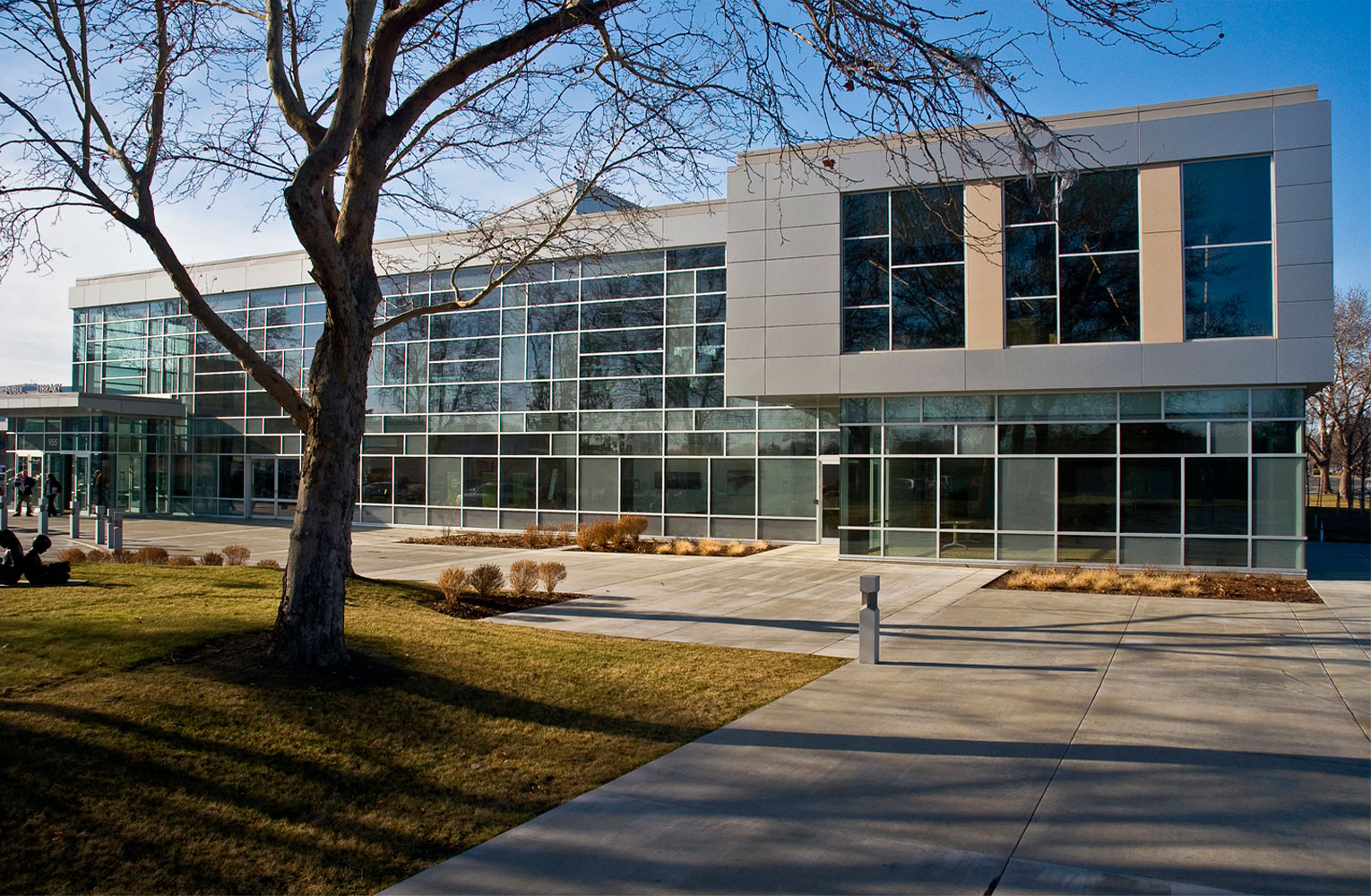
FFA designed the renovation and expansion of Richland’s existing 33,000 square foot library. The project modernizes and upgrades the facility as well as expands the library to a total of 58,000 square feet. The existing 1960s-era one-story building was designed in a “bunker style” of modernism using dark finish materials and heavily tinted glass, all lending an unfriendly, imposing atmosphere to the cramped, outdated facility.
A new two-story atrium/lobby provides a civic presence on the site and organizes new spaces for public meeting rooms, friends of the library retail, and a café. With many mature plantings and trees on the site, FFA has designed an expansion that utilizes available open space on the site, pushing inviting new spaces for collections, lounge seating, and community meeting rooms near the edge of the site. The new, light-filled spaces open to trees that line the perimeter of the block, creating the feeling of ‘reading under the trees’.
2009
25,000 sf addition
33,000 sf renovation


The Richland experience with FFA has been excellent. The team has shown great depth of understanding of the structure of public funding and public process. They have been very responsive to both community and library staff, the customers, and to the need to provide beautiful, quality design without extravagance.
Anne Roseberry
Former Library Director, City of Richland


INTEGRATION OF OLD AND NEW
A metal panel system with precast concrete complete the material palette of the new extension, lending a high-quality, contemporary feel to the facility. The goal of design integration between the old and the new was met by using a material color palette that works with the existing finishes and replacing all of the old dark glass with new clear high-performance glass, making every side of the building a new composition.


